Design by Danaham Associate
Design: Jeong Su Jin, Seo Hee Yoon, Yoo Ji Yeon
Location: 165 Yanghwa-ro, Mapo-gu, Seoul
Completion: 26.4.2023
Superduper, the first San Francisco burger brand to be launched in Korea. It was designed to combine the leisure of San Francisco and the city life of Seoul to provide customers with not only a delicious meal but also a pleasant spatial experience. An energetic façade that fits the characteristics of the site, a kiosk vestibule filled with the San Francisco sunset, an interior with a mix of metal and wood materials, and even a circular suspension that supports the space. The entire process from the moment customers first encounter the space and enter it is filled with joy. Introducing the Superduper project that provides a fast but slow space of enjoyment.
Experience the leisure of San Francisco in fast-paced Seoul
Superduper is the first global San Francisco burger brand to launch in Korea. It contains the value of slow food, but through the localization process, it has integrated the future-oriented and trendy characteristics of Seoul. In a fast-moving place, we intentionally have a sense of slowness. A gourmet experience enjoyed in a fast yet leisurely space. Superduper Hongdae is a delightful combination of the leisurely mood of San Francisco and the urban city life of Seoul.
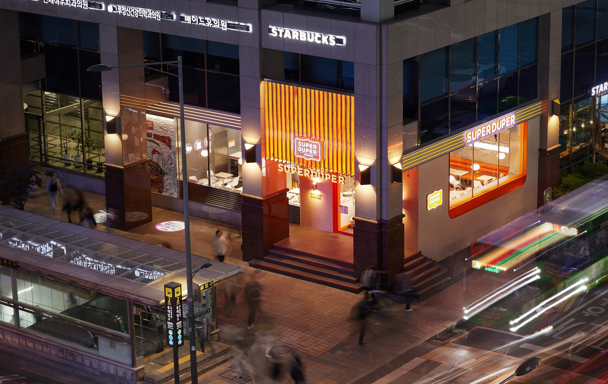
Superduper Hongdae branch is located at the entrance to exit 2 of Hongik University Station, and is an area with a rapidly changing trend, with young people and foreign tourists as the main floating population. Located on Hongdae’s main street, which connects to Sinchon, Hapjeong, and Yeonam, this place has an excellent geographical advantage, and we focused on designing a three-dimensional façade to express the passion and vitality that are the characteristics of the site.
The Façade’s Joyful Day and Night
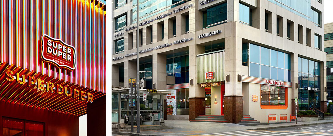
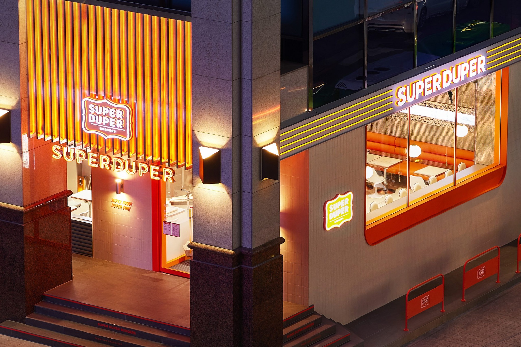
The façade is a place where strong brand power is designed to attract the attention of everyone walking around. This space, where orange-colored linear vertical lines flow organically, is a means of representing the energy of Superduper as well as the vitality of Hongdae. Superduper’s passion is more evident after the sun sets. Neon lighting was designed so that not only those using the space but also anyone looking at it can remember and enjoy the energy of Superduper, expressing the joy of the street that does not go out even at night.
The most pleasant spatial experience
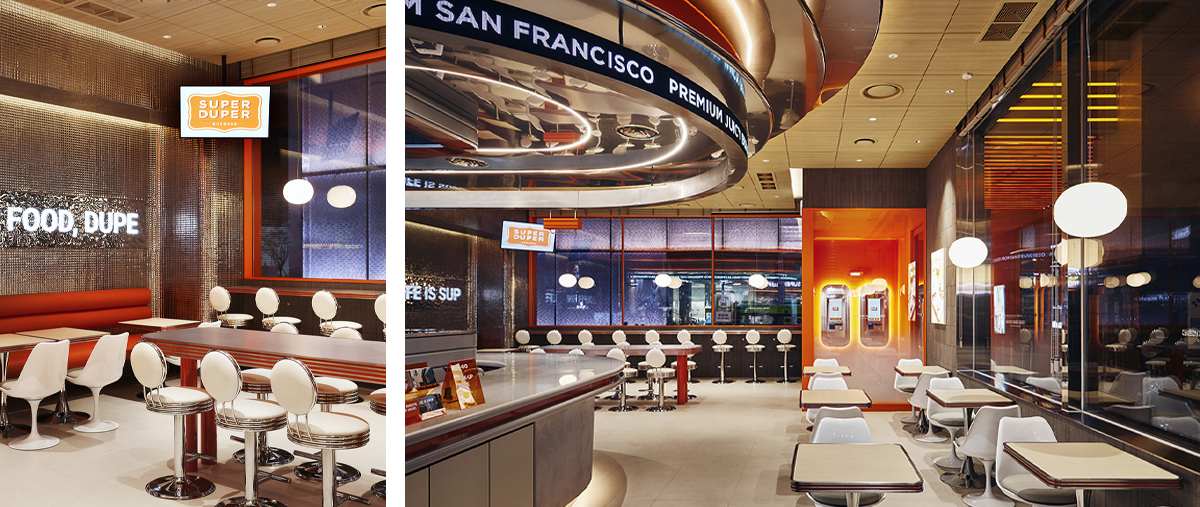
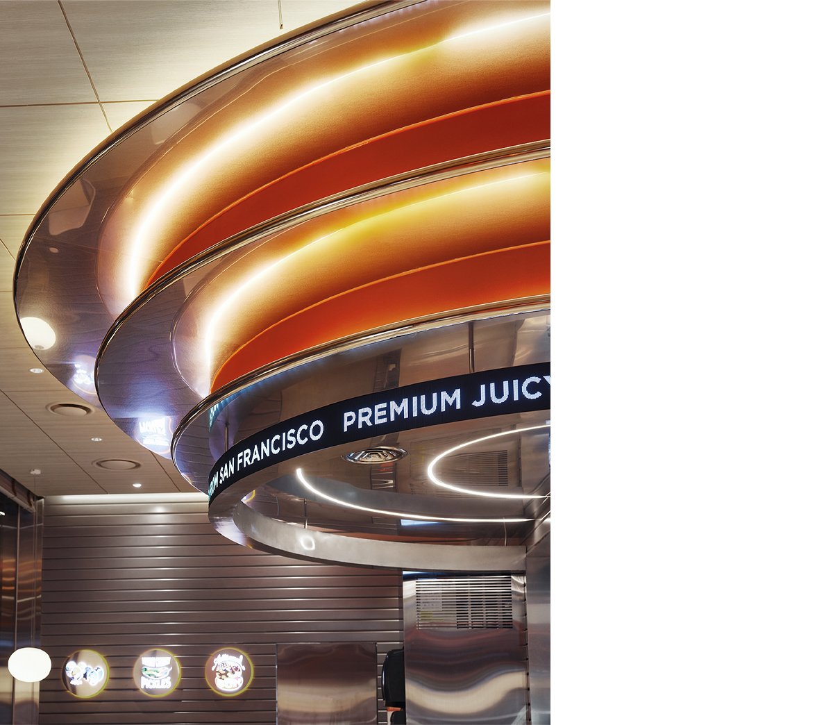
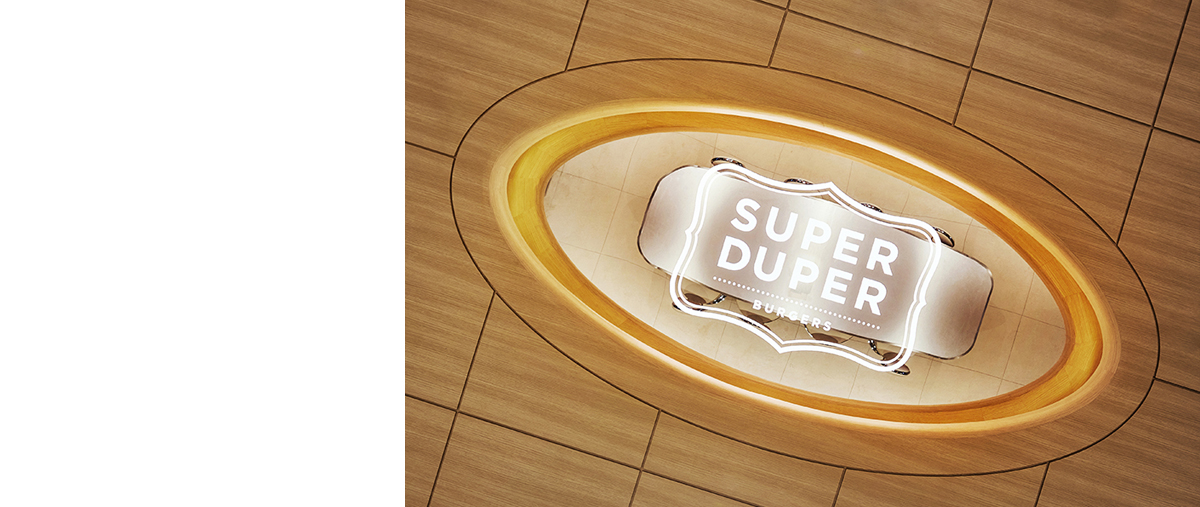
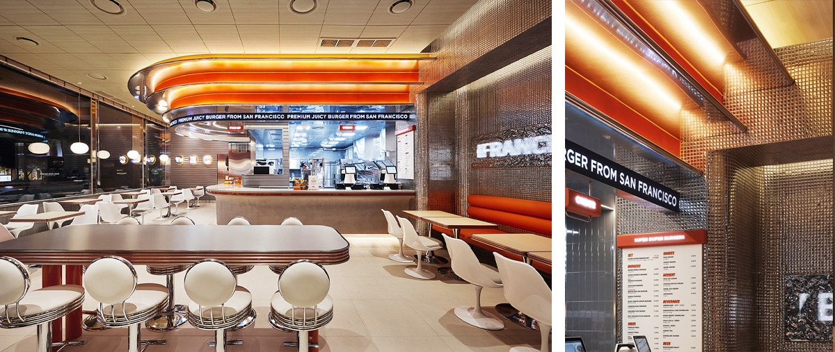
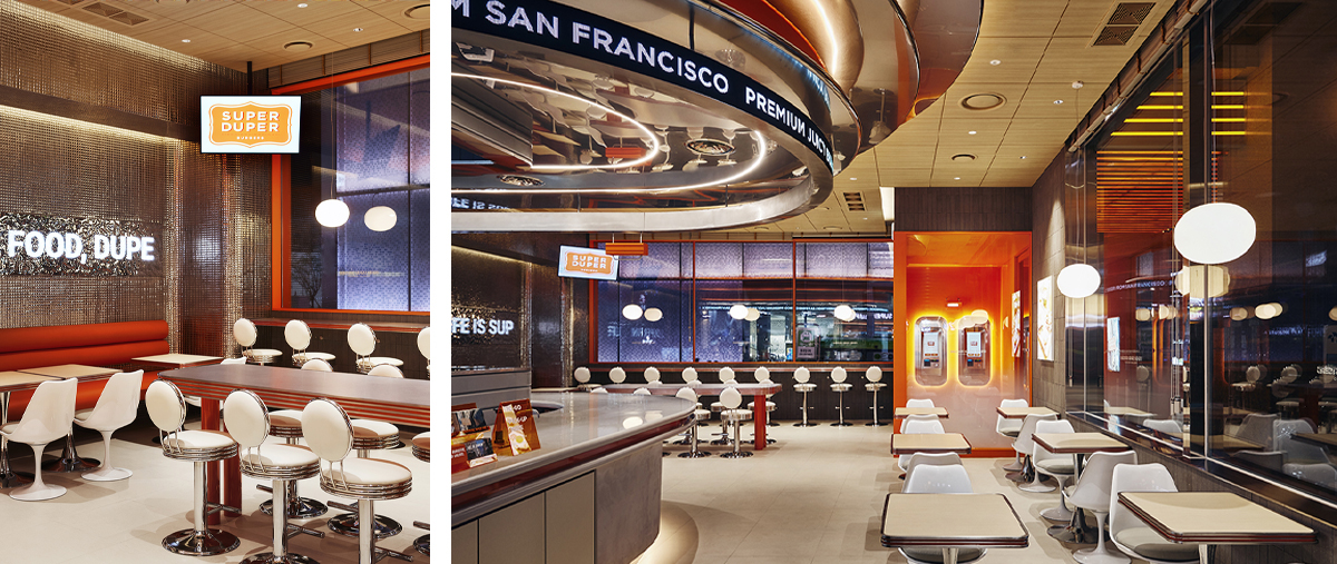
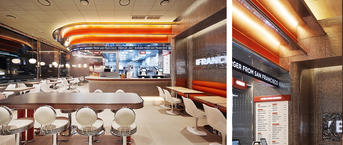
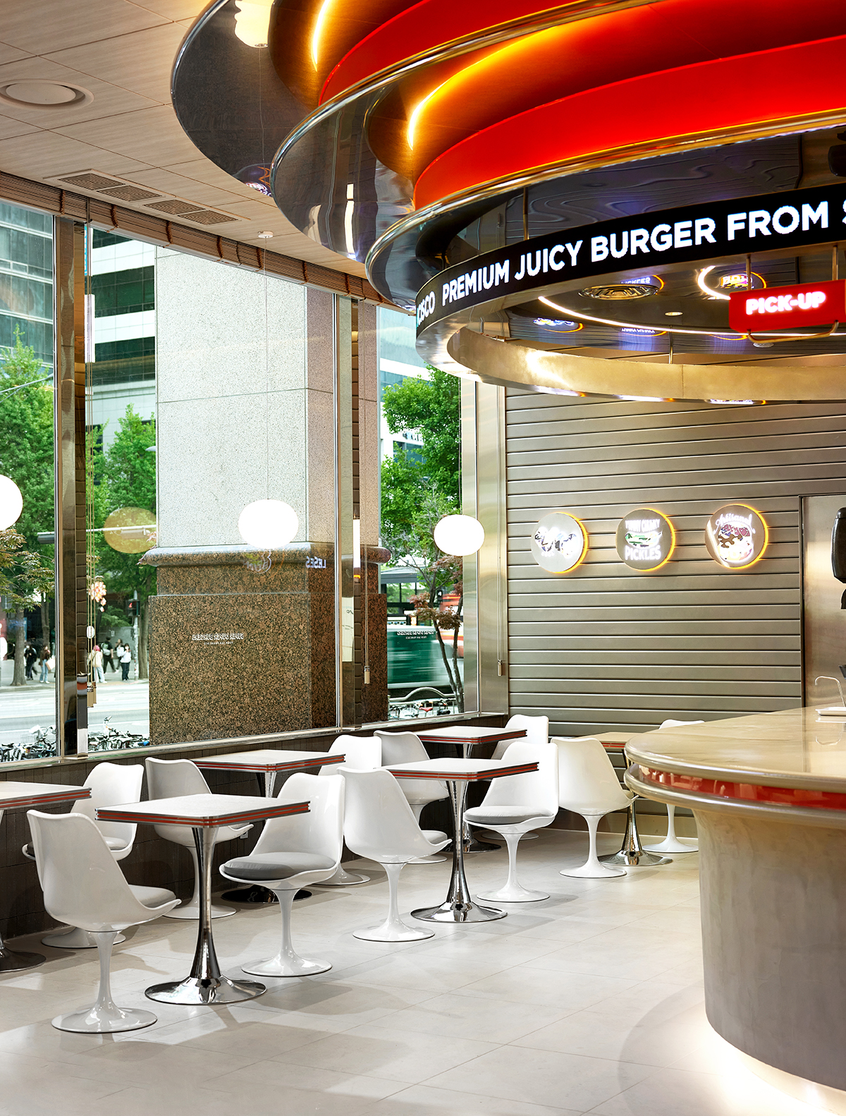
Metal, wood, and an active orange color that symbolizes the sunset of San Francisco. The combination of contrasting properties is a pleasant spatial expression that can only be felt at Superduper. The central circular suspension functions as a focal point that can control the volume of the space and as another identity of Superduper. The well-ceilinged mirror suspension located at the top center of the table is a window that can connect the two, me and Superduper in the mirror. It provides a mutually connected spatial experience as a device that can contain joy and interest to those who look up and the vitality inside the space.
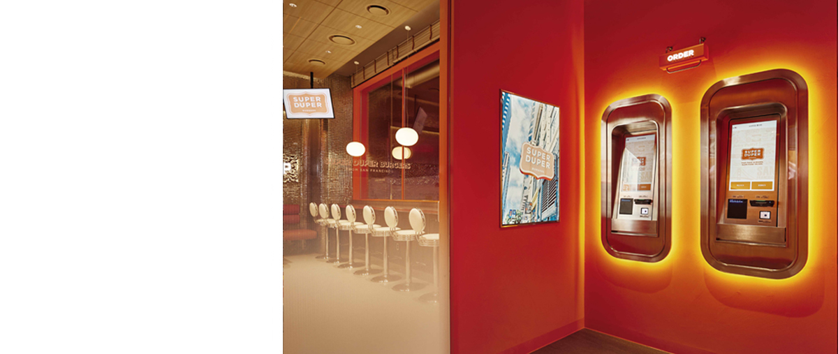
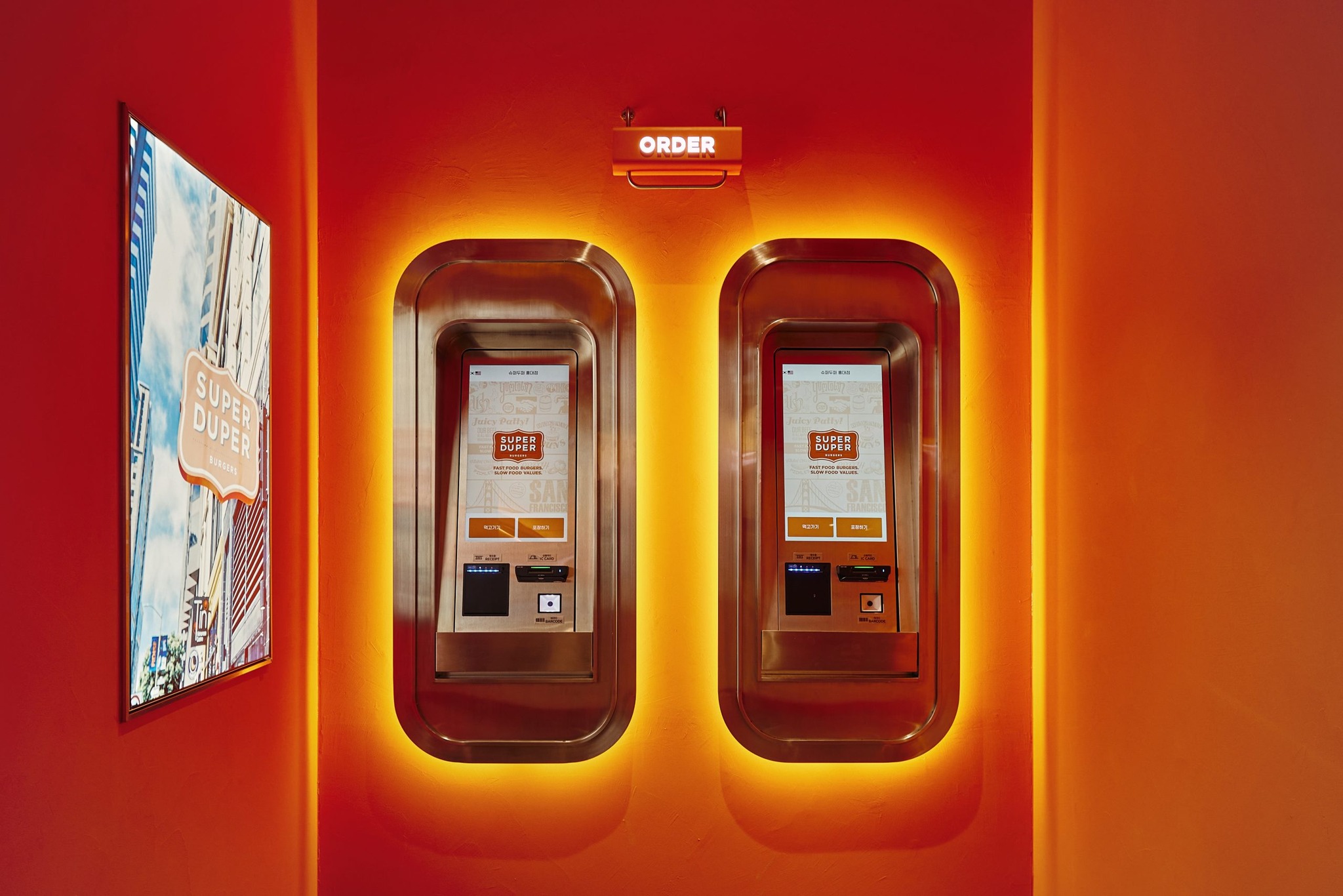
The Kiosk Zone is the space that most directly expresses the mood of San Francisco’s sunset. The vestibule is naturally drawn in by the sensual façade. The intense orange color that fills the entire space simultaneously expresses the sunset of San Francisco and the passion of Seoul, drawing out the diverse senses of customers.
There are plans to open more branches after Superduper Hongdae, but we need an energetic space narration unique to Hongdae under the same theme. This project is a delightful interpretation of Danaham’s space so that when you think of Superduper, you will always remember the liveliness and joy of Hongdae.